Twilight lends itself to the shoujo manga format much better than in prose or in film. Young Kim’s renditions of the characters are disarmingly gorgeous, but even they can’t redeem Stephenie Meyer’s story of destructive co-dependency. And then there’s the font.
Jen, graphic designer extraordinaire and pop culture aficionado, generously agreed to do a guest review of this graphic novel. You can read more of her writing at Evening Hour.
Ah, Twilight, the stuff that dreams are made on. It’s not every day that one book, whose very premise was born out of a dream—so its creator, Stephenie Meyer, says—can reduce the time-honoured traits of popular culture’s great vampires to glittering giftwrap in the sunlight. When Kat offered the comic for me to review, who was I to refuse the chance to return to all the loltastic awfulness that encompasses Twilight?
These days, comic book adaptations serve as extended editions in a sea of franchise fodder. Often poor and hurried productions, they’re an easy marketing tactic to gain revenue on the side and to appease the voracious and loyal consumer. For the disinclined readers among us, comics can be a great alternative to absorb a self-contained story without sifting through the boring bits, like watching the film version in one sitting.
Unfortunately, no fast-food serving of Twilight could possibly make me hungry for more.
Yet, despite the frequent jibes I make at the popular YA book, this first volume of the graphic novel is mostly successful. It reminds me of the story’s immediate appeal to impressionable readers, but it also reminds me exactly why I eventually abandoned the series. What most stands out is how much better the story lends itself to the shoujo manga (girls comics) format than it ever has in prose or on film.
The book itself is quite beautiful: black hardcover binding, smooth glossy jacket with the title printed in silver foil, a compelling illustration of Bella, her face looking longingly at what is Edward, who appears on the second volume. It holds nicely in the hand, weighty but comfortable enough to flick through, and stands well on a bookshelf. Paper stock is a good grade. So far, so good—at least the print production values are on par with a typical graphic novel.
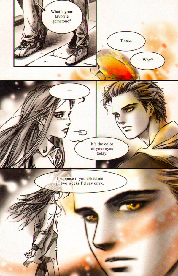
Korean artist Young Kim takes on the gargantuan task of adapting and visualising Twilight’s characters and locations. As I pledge no allegiance to any of them and only have a fuzzy recollection of their descriptions, I take no issue with how they look. Hey, I’m not going to complain that Bella and Edward look far more aesthetically pleasing than their live action counterparts. Occasionally I was bothered by how similar some characters looked to each other; it was a bit confusing, but Kim’s practice in character design shows—no one has looked more uniformly beautiful. This is a very good thing given that the dialogue and monologues, no matter how condensed, remain painfully silly.
The illustrations are rendered almost entirely in black and white—a thoughtful decision in this case: colour is sparsely applied to great effect, accentuating mood and tone. The town of Forks is appropriately dreary in neutral greys, while Bella’s dream sequences are pitch black with splashes of vivid reds and greens. And the eyes, those dazzling pools of liquid gold…
(Click on the images to see the full size.)
Then of course there is the infamous meadow scene, awash in lush gold, blue and green hues. I very much enjoyed the moment when Edward revealed his true self to Bella. It’s a lot more subtle than the movie’s version.

Did I mention it’s subtle?*
Kim’s disarmingly gorgeous renditions of people are dazzling, but even she can’t redeem the disturbing nature of the original story. Underlying the innocent and restrained art is one creepy relationship, involving two individuals leading a life of destructive co-dependency. One oversteps the border of protection and concealed violence to the point of suffocation, while the other ‘irrevocably’ lusts in obsession over that which she cannot have—the ultimate forbidden fruit.
To her credit, Kim composes some dynamic layouts for such repeatedly banal and saccharine scenes. Twilight is foremost a slow, restrained romance, not an action-packed thriller, so there are pages and pages of Bella’s wounded and longing gaze (it alternates) or Edward’s fierce sideways glare and smile (this also alternates to more comedic effect). Kim salvages a lot of what is wrong with Meyer’s story and writing sheerly by way of visual distraction.
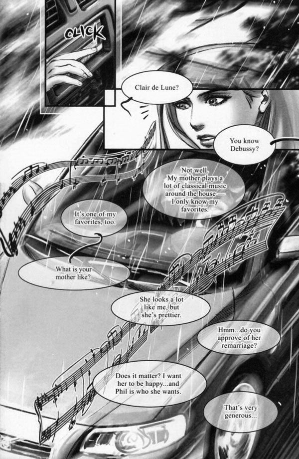
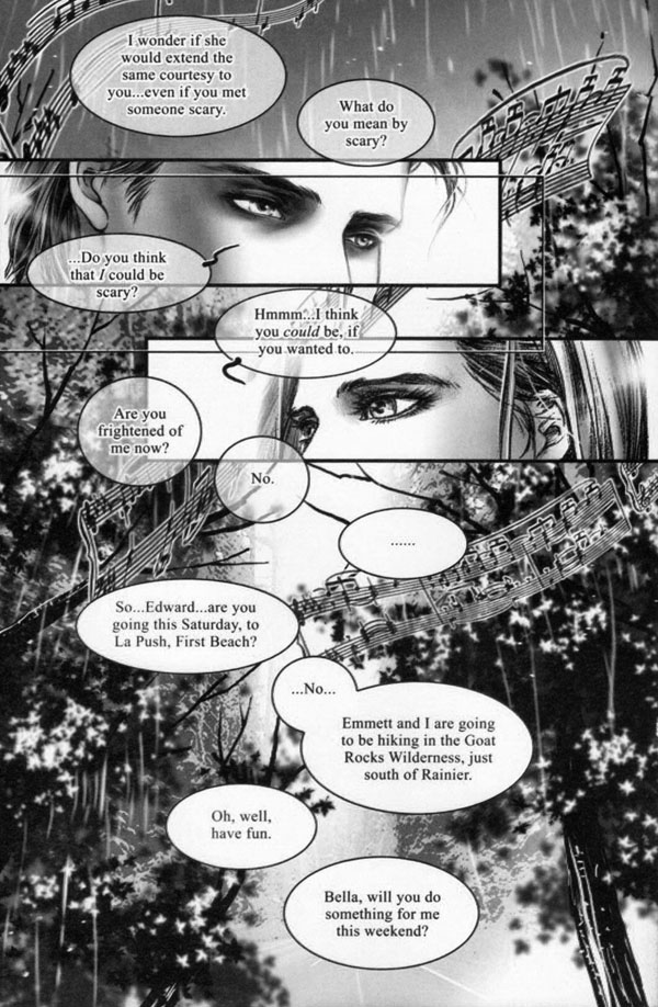
While Kim’s drawings are beautiful, they are poorly complemented by shoddy backgrounds and textures, which suspiciously look like photographs gone through a few default Photoshop filters or three (you know there is a problem when you recognise all the default Photoshop brushes). This juxtaposition is quite common in Asian comics, not so much Japanese manga, but I have observed this technique used in Chinese manhua and Korean manhwa. I don’t know if it’s because the artists prefer to focus on their characters, have a restrictive budget, or are just cutting corners, but I don’t think it does them any favours doing a job by halves.
What ultimately ruins the book is something seemingly inconsequential: the lettering.
Good lettering in a comic is like good inking or colouring—it blends with the other core elements and does its duty in not disturbing the reading experience. I wasn’t so horrified to see that the lettering wasn’t hand-rendered but actually set in a default cursive font, Monotype Corsiva, and curse of all font creations, Times New Roman (considered by many as the worst font in the world)!
So? At least it’s not Comic Sans, or Zephyr! you might say, but there you’ve missed the point: to pick default is to demonstrate no forethought for subject or context. Granted, the original novel is set in Times New Roman, but it is a ghastly choice for the graphic format. For one thing, Times New Roman’s very default-ness detracts from Kim’s lovely art. Even if the setter (who I strongly suspect isn’t being paid enough or has absolutely no idea about typography and layout) intended to echo the novel, he or she only succeeded in highlighting Meyer’s awkward prose; not to mention the Photoshopped speech bubbles thoroughly drown pages with their unnecessarily chunky sizes and inconsistent white and transparent backgrounds.
There is just so much that’s wrong with the lettering. Look, they’ve even covered up beautiful Edward! BLASPHEMY!
SO.

MANY.
UGLY.
BALLOONS.
As a result the entire graphic novel is reduced to looking unprofessional and cheap, which is a shame. I can forgive the Photoshopped background paintings; I can forgive panels filled with Bella’s asinine introspection; I can forgive even the mind-numbing plot, but I cannot forgive the haphazard way in which the writing has been presented. A story without any text would be fine—preferable, even—but to see an element so integral to visual storytelling displayed in the most amateur fashion is an insult to both the readers and the creators. I find it very difficult to believe this was Kim’s doing; Meyer also carefully oversaw each panel, yet I’m incredulous at the fact that such thoughtless consideration for the lettering was accepted for print by Hachette. Certainly not all comics have the luxury of being hand lettered, but I would imagine for something as massive and lucrative as Twilight, hiring a letterer or even a typesetter or designer would not have been a financial setback at all.
The art of lettering, especially in a comic, is a craft that takes years to develop and master—it essentially shapes the way we read; it emphasises tone and pace, which makes it so critical to a solid reading experience. Twilight reads like a monotonous beginner lecturer in a dull as hell seminar. It lacks rhythm, it has no emotion—it’s boring and unsightly. Logically organising text flow and choosing suitable fonts would have elevated Twilight’s mediocre story into something more durable, evoking a depth and poignancy that would be impossible in the written novel. As it is, I can’t recommend the graphic novel as something worth looking at, let alone reading. I lament that a fantastic opportunity to offer invested fans a treat while providing an opener to readers new to graphic novels is ultimately sullied by a few bad decisions.
Why do I still say it’s successful? While the graphic novel in no way endears me to the written one—indeed no medium on this earth could ever make Meyer’s story good—this is as good as it’s going to get. The sad fact is that this book will sell really well no matter the quality (when Twilight toilet paper actually exists, there is something fundamentally wrong about the world). Over 66,000 copies were snapped up in the first week of release in the US alone, which doesn’t come as a surprise.
If there is one thing I have learnt from Twilight, it’s that there is nothing so awful that can’t be improved with a bit of sparkle. You can’t imagine how that feels.
*SO*

*MUCH*

*SPARKLE*

(Perversely, I hope there is some interactive iPad book version that includes functions like ‘Choose Edward’s Level of Sparkle! Seizure-Inducing, Dazzling, Incandescent grades available!’)
Yay or nay?
Twilight fans will delight in the graphic novel’s faithful depiction of the story and its characters, likely glossing over the god-awful lettering and all that’s disturbing about the story. So long as they’re happy. As for the remainder of us outside the target audience, let’s just say it’s a lot more tolerable than watching KStew’s and RPatz’s vapid faces for two hours.
Who might enjoy it: Twihards and people too afraid to touch the written novel but are still curious may want to try their hand at the comic book instead
Who might not enjoy it: Times New Roman haters, newcomers to comics and graphic novels, and anyone looking for a prime example of a quality comic today
*All additional sparkles added by me and trusty Photoshop. I take no responsibility for any excessive dazzlement. If pain persists, please refer to any Dr Seuss picture book for immediate relief.
A review copy of this book was generously provided by Hachette Australia. The local hardback edition is available, and the B format edition will be released in February 2012.
Title: Twilight: The Graphic Novel (Volume 1)
Series: Twilight Saga
Author: Stephenie Meyer and Young Kim
Publisher: Hachette Australia
Hardback: 9781905654666 (3/2010)
B format: 9781907411526 (2/2012)
AUSTRALIA: Booktopia | Booku | Fishpond | Galaxy | Other
WORLDWIDE: Amazon UK | Amazon US | Book Depository | Library


Great review! I can see how the narrative fits the shoujo manga format better. I think it actually came out in Japan as a shoujo manga, and from what I remember, the art looked great.
I see your point about the lettering! Made me wish I could peel them off and just have a wordless book!
OMG! Peel and stick speech bubbles for Twilight. That is so full of win. :D
@Katrina – It didn’t occur to me till I started reading the graphic novel that the Twilight story is CLASSIC shoujo manga—textbook case, in fact. Helpless, clumsy human heroine, somewhat effeminate but irresistible vampire (or some other supernatural/paranormal) hero, an equally irresistible rival love interest … I guess I had to have the visual triggers to realise!
@Kat – Peel and stick speech bubbles has SO MUCH potential! Notoriously crap fiction needs this sort of option.
I never checked out the graphic novels, but I confess I am a fan of the books and the movies (faults and all).
I like that you decided to review it as objectively (as possible) even though you obviously find it loltastically awful!
You are right about that boring font and those ugly bubbles. What were they thinking??
@sharon I think I have all those years of writing critical essays to thank. I’ve learnt to stay objective, because even if I despise a creative work I think there is always some kind of merit in it, even the smallest grain of it (well, OK, there are exceptions). And as much as it’s disturbing to consider, Twilight obviously strikes a chord with many readers; I appreciate that, even if I don’t necessarily agree with it. When I read the first book I breezed through it quite quickly myself. Plus, I’m a bit of a crusader for bad taste in pop culture, so I can’t really talk much can I!
Since you’re a big Twilight fan, I can safely vouch that you’ll enjoy the graphic novel—so long as you can overlook the lettering! ;)